
Keep the whole thing.
SCRAN, the ampersand and PINTS belong together. Use the supplied artwork with its original proportions and spacing.
 YouTube
 SCRAN & PINTS / THE BRAND TOOLKIT
Our logos, colours and type. A few simple rules.
Everything you need to make it feel like us.
01 / THE FULL MARK
The original red and black lockup.
Always together. Always recognisable.
Both downloads contain the full logo with a transparent background.
SCRAN, the ampersand and PINTS belong together. Use the supplied artwork with its original proportions and spacing.
Leave clear space around every edge. Keep other text, borders and illustrations outside that space.
Use the full-colour logo on paper or a light, plain background. On a busy photo, give it a cream panel.
Keep its colours and shape. No stretching, bending, rearranging, outlines, shadows or extra effects.
02 / OUR COLOURS
Warm paper. Dark ink. A hit of red.
Keep these three at the heart of it.
#DB0B19RGB 219 / 11 / 25The punch. Headlines, highlights and calls to action.
#151310RGB 21 / 19 / 16The backbone. Text, rules and strong contrast.
#FBF0DFRGB 251 / 240 / 223The canvas. Warm backgrounds with room to breathe.
Use ink on paper for longer text. The logo itself retains its original pure black (#000000). Ground-specific colours belong in the stamp artwork; the main palette stays consistent. HEX and RGB values are for screen use.
03 / THE TYPE
A little print-shop character,
with everyday readability.
Our textured display face. Big headlines, short statements and plenty of space.
Body copy, navigation and buttons. Clear, direct and easy to read. Helvetica is the fallback.
Good scran. Questionable detours. Another stamp in the book. Follow the journey, find your next ground and watch the verdict.
Labels, collection numbers and supporting details. Short lines with a typewriter feel.
The logo is supplied artwork, not editable type. Always use the logo files instead of trying to rebuild it with a font.
04 / PUTTING IT TOGETHER
Circular stamps, stadium illustrations and warm paper. Ground colours give each one its own identity; the full logo ties the collection together.
Explore the passport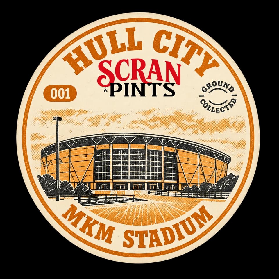
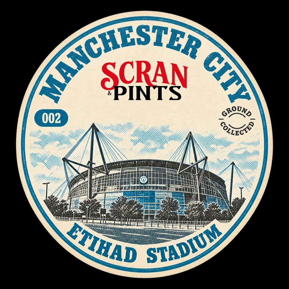
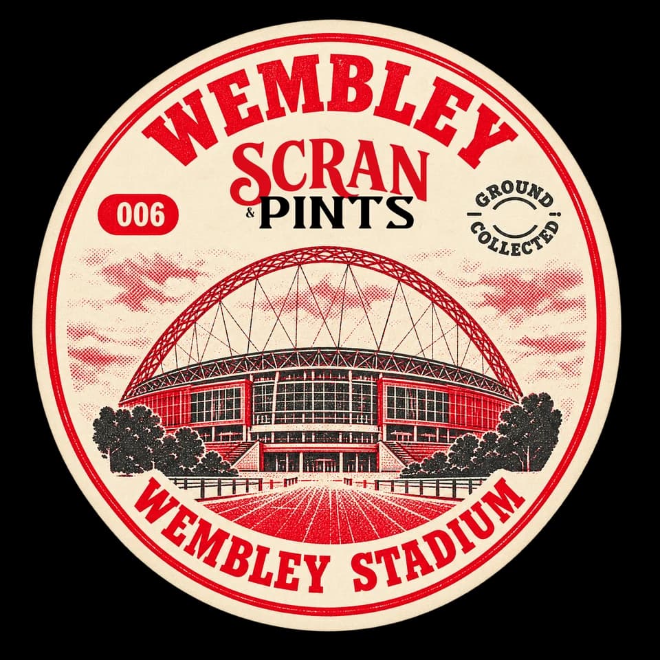
Friendly, curious and straight to the point. Talk about the food, the pint and the day out. Keep the verdict honest and the language human.
“Every ground. Every verdict.”